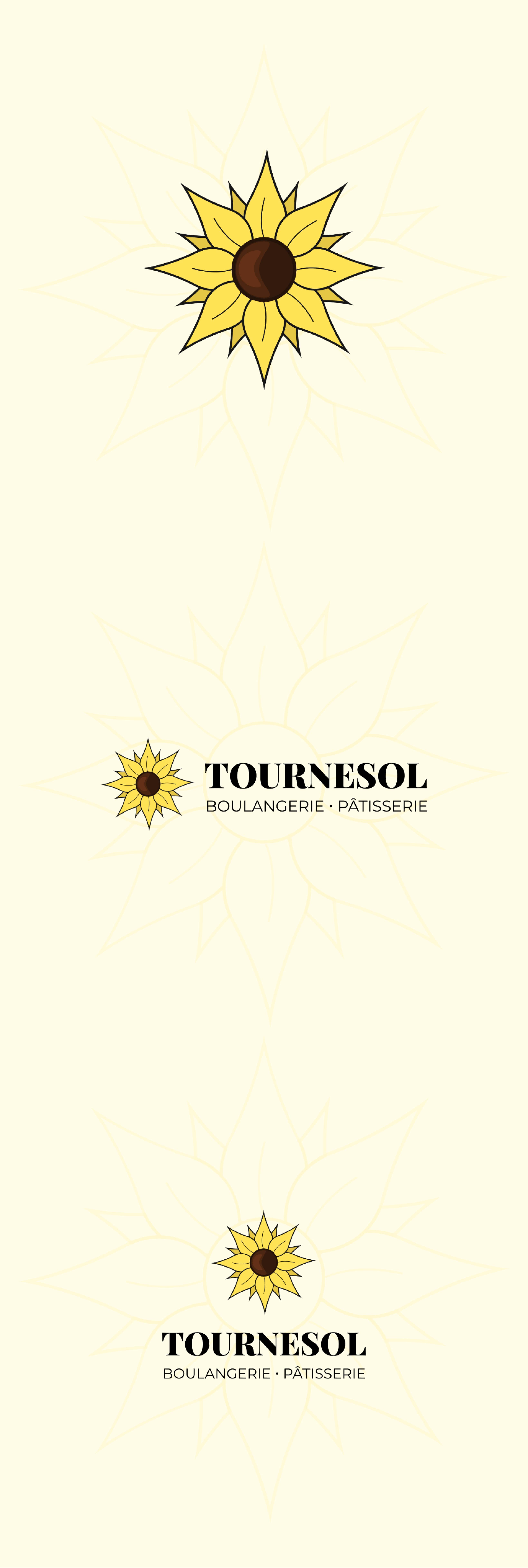
Boulangerie Tournesol is a non-existent, practice web design project for a bakery/pastry business. The name was inspired by a bakery in my neighborhood, and it means “sunflower” in English.
The first step of this project was to come up with a logo. It was quite straight-forward to opt for a sunflower, and that’s what I did. I wanted to keep it simple concept-wise. Originally, the yellow of the logo was too bright and flashy, it got replaced by a more muted yellow which ended up satisfying me.
When it comes to the design of the website, it’s simple yet playful. I imagined that if I was an user browsing the website, just looking at the title of the sections would make me go get some pastry. So they had to look fun but also as if you could eat them.
The main goal of the website is ordering, contacting and finding the location on maps.


